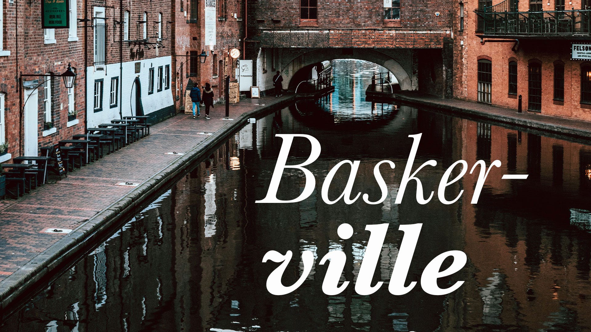
This essay is part of a new series I’ve been working on, titled About Typefaces. They are my own way of going back to basics and remember what I loved about design in the first place. Enjoy!
John Baskerville was such a badass. He was born in 1706 and worked as a servant in a clergyman’s house, where he first encountered calligraphy. The man got obsessed with penmanship and handwriting techniques, even while he was still illiterate. He saw. He practiced. He conquered.
By the early 1730s, Baskerville had started a type foundry, determined to perfect the printing process. If there is anything that being a designer and studying other designers has taught me, it’s that we are a bunch of obsessive, highly critical perfectionists who can drive anyone up a wall. In true resonance with that school of thought, Baskerville “spent many years in the uncertain pursuit, sunk 600 pounds before he could produce one letter to please himself,” according to William Hutton’s An History of Birmingham.
In their self-titled type, Baskerville increased the contrast between thick and thin strokes, making the serifs sharper and more tapered. He shifted the axis of rounded letters to a more vertical position, and the curved strokes became more circular in shape, creating greater consistency in size and form.
The overall effect was letters that appeared “rounder, more sharply cut” than their predecessors. Baskerville’s type included lowercase numerals, which were the only form of Arabic numbers in use at the time. The capitals are notably bold and, like Caslon’s, have been criticized for appearing unbalanced against the lowercase at large sizes.
The reception was not great. Many claimed his style was “too stark” and that his printing “damaged the eyes,” making the typeface essentially obsolete before it had a chance to catch on.
John Baskerville, however, was not done with the printing industry. He experimented extensively with paper and ink manufacturing to make reading more legible and easier on the eyes (a response, perhaps, to the initial criticism of his typeface). He created a much darker ink through a “tedious process which resulted in boiling linseed, dissolving rosin, and letting it rest for months before use.” In other words, he invented the first truly black ink. Badass.
He also developed a highly glossed paper that, combined with his new ink, gave his printed works a bold quality that stood out from contemporary printing. On the page, the strokes of each letter were crisper and cleaner than most printers before him could achieve.
Baskerville had no formal training in printing. He followed other printers around and invested in the same equipment they did, then obsessively experimented until his heart was happy. That self-taught approach gave him the freedom to question established practices and seek better solutions. Did it make him popular among his peers? Probably not, but oh well.
As an avowed atheist (though later scholars have disputed this characterization), Baskerville faced additional skepticism from conservative printing circles that already viewed his modern approach with suspicion. His independence of thought extended to every aspect of his life and work.
The first work Baskerville published using his new typeface was an edition of Virgil’s epic Aeneid in 1757, followed by other classics, including an edition of Paradise Lost. His typography was much criticized in England during his lifetime, and after his death his types were purchased by the French dramatist Pierre-Augustin Caron de Beaumarchais.
The Baskerville type was essentially obsolete until 1917, when Bruce Rogers revived it for the Harvard University Press. After that revival, its popularity increased dramatically. Its clarity and balance make it an excellent typeface for continuous reading, and it has been revived repeatedly with various features and in different qualities.
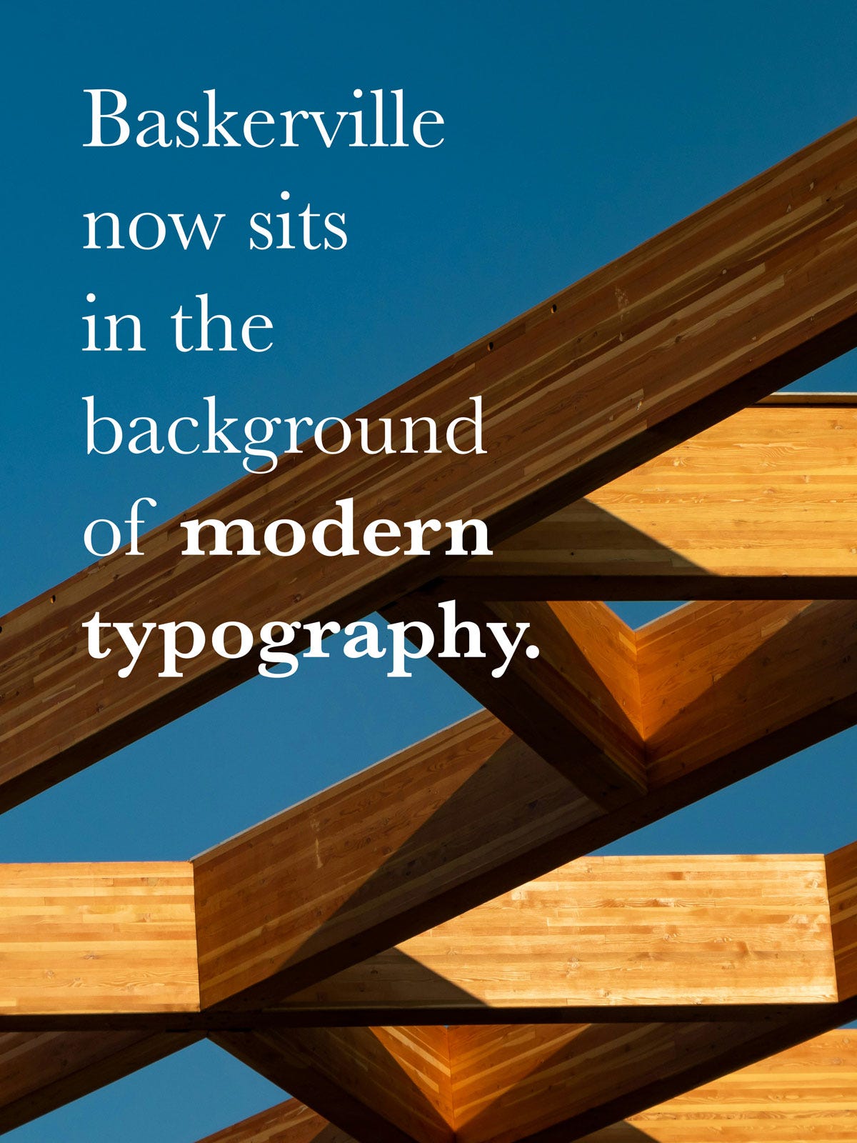
Today, the typeface remains popular for book design, a favorite for literary works, academic publications, and quality printing where both aesthetics and legibility matter.
The British Monotype Corporation cut a copy of Baskerville in 1923 for its hot-metal typesetting system, showcased in Penrose’s Annual of 1924. It was extremely popular for printing in Britain during the twentieth century. As with other Monotype revivals, the design is now sometimes called Baskerville MT.
In 1996, type designer Zuzana Licko created a contemporary Baskerville-inspired typeface known as Mrs Eaves. Inspired by Baskerville’s curving lines, Licko wanted to maintain the welcoming feeling the typeface conveys, demonstrating how Baskerville continues to inspire new interpretations.
Unfortunately, John Baskerville passed away in 1775, so he never experienced any real fame or wealth from his now-cherished font. Down into typography history he went, just like Garamond and countless other artists.